We put our own website through the review we give clients. Here is the report card.
September 2, 2026 · 7 min · Daniel Lewis
Our site scores 95 on Google's speed test, the copy is the best thing we have written, and it still had the problems we find on client sites every week. So we built a review machine, pointed it at ourselves, published the scores, and started rebuilding in public. The report card is below, and there is a PDF you can keep.
Every website built with AI in 2026 has the same tells. The little mono index labels, like /02, before each section. A dot that pulses to say someone is available. The same dark card, forty times, with the same arrow in the same corner. We noticed them on our own site, which is uncomfortable to admit, because we sell websites.
The bigger problem hid underneath the cosmetic one. A site can be fast, accessible, and well written and still not show the thing it sells. Ours had a headline we are proud of sitting over a wallpaper, 32 services wearing one identical frame, and a visitor arriving from Google on a service page with no clear way to act. Those are exactly the problems we find on client sites every week. The honest move was to grade ourselves the way we grade a client's site before an engagement, and to publish the result.
The review machine
We build machines, so we built one for this. Forty-eight specialized reviewers, each with a single job, working from the live site, the source code, and 130 screenshots at phone, tablet, and desktop widths. Seven critics went first: an art director who judges award sites, a motion director, an information architect, a conversion specialist, a performance and accessibility engineer, a brand guardian, and a skeptical buyer who read the site twice, once as a roofer on his phone between jobs and once as a clinic operations director at her desk.
Every critic's findings were handed to a skeptic whose only job was to prove them wrong. Findings that could not survive that argument were thrown out, and only what survived counts below. Then six concept designers each took one seed idea for a signature scroll scene, and three judges scored every concept: an art director for craft, a buyer for whether a stranger understands it in twenty seconds, and an engineer for whether it can be built without slowing the site down. Two architects proposed how the catalog should be organized and bought from, and two critics attacked each plan. A last reviewer listed everything the others had missed. Forty-three minutes of machine time, then a human editor merged it all into one report.
This is the same review we run on a client's site before we touch it. The difference this time is that the site was ours, and we are publishing the scores.
The report card
The scores are out of ten. The speed and accessibility discipline scored a seven, which is where the site's engineering has always been strong. Everything a shop owner needs in order to actually act scored a four.
Art direction, 6: the best possible version of the dark-agency template, award-grade typography and copy over stock composition. Motion, 5.5: disciplined, and a pattern library rather than a piece, with six screens of scrolling before the first machine appears. Information architecture, 4: excellent information, absent architecture, three unranked front doors to the same 32 services. Conversion, 4: the path to buying stops one click before money on almost every page. The skeptical buyer, 4: the roofer gave it a three and the clinic director a five. Performance and accessibility, 7. Brand, 6: on-token but off-motif, because the bracket in our logo is our best visual idea and we were using it as a logo only.
What survived the review untouched matters as much. The headline. The printed prices and the honest-math paragraphs. The bilingual system. The 32 hand-drawn service motifs. The 51 written guardrails. The engineering rules that keep the site fast. Nothing here needed a redesign. It needed one continuous scene about what the machines do, a card system with a scale, and the section furniture retired.
What it found, in plain words
The product had no visual body. The home page opened with a slogan we like over a faint contour field, and the right half of the screen was empty. Nothing on the first screen showed a machine doing anything.
Every product wore the same card. A product that costs $99 a year and a system that takes weeks to build shared one frame, one type size, one corner arrow. A visitor scanning for the right thing had no scale to read.
Traffic from Google landed without orientation. Our search traffic arrives on service pages and stories, not on the home page, and those pages assumed the visitor had already read everything above them. Some of them ended at a waiting list instead of a way to act.
The tells were in our own brand book. The mono index, the dot before each label, the uniform card: our design system prescribed them. Retiring them in the code without changing the book would only grow them back.
Six ideas for a scene, one winner
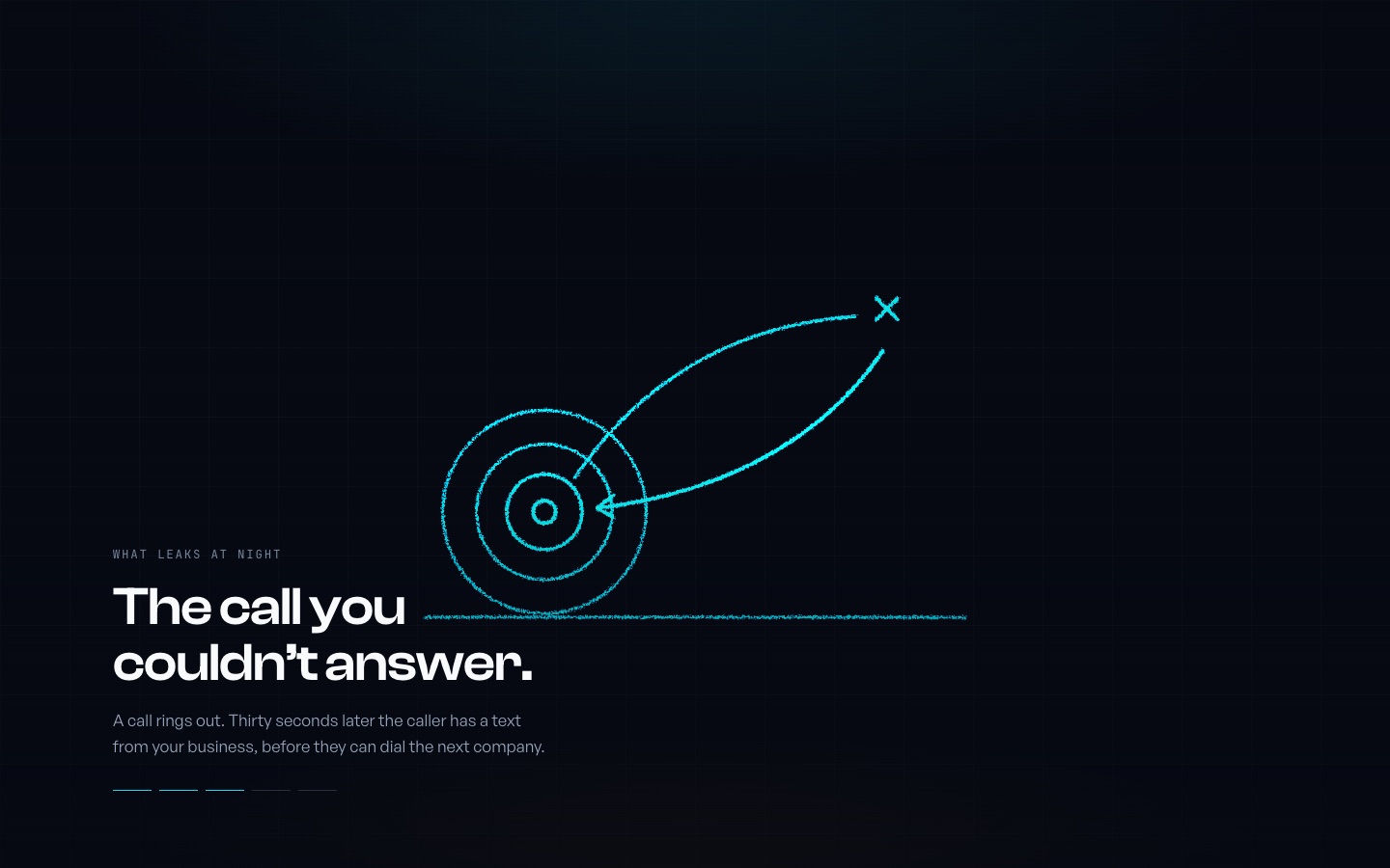
The brief was specific: the kind of website where a product comes apart and reassembles as you scroll, for a company that sells no physical product. The panel produced six answers. An exploded machine. A wiring blueprint of a shop. The contour field sorting itself into a catalog. A living node graph of the lab. The headline taking itself apart into letters. And one night.
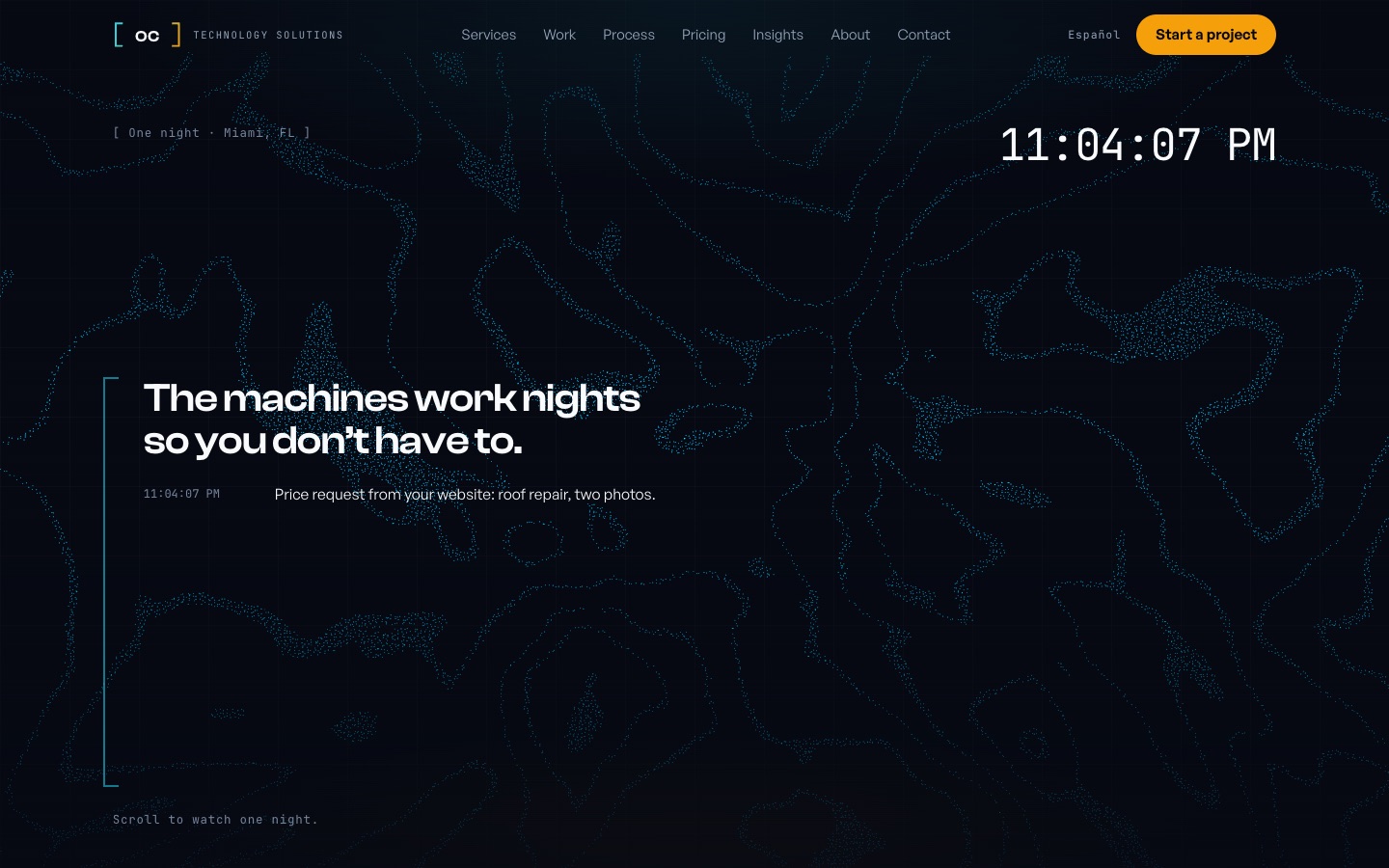
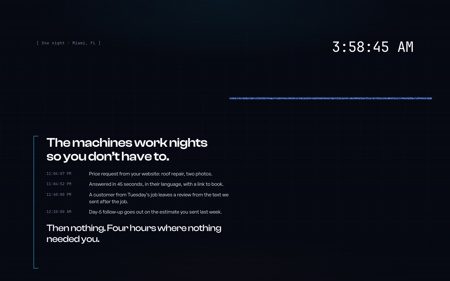
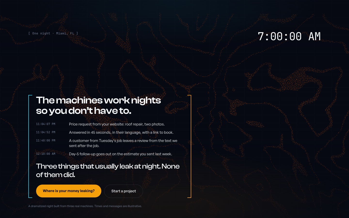
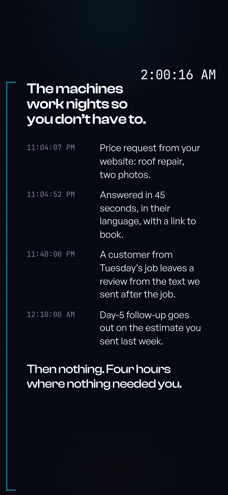
The night won, with all three judges voting to build it. Scroll is a clock. It opens at 11:04 PM with the owner's phone face down. A price request comes in from the website and is answered in under a minute. A customer from Tuesday's job leaves a review from the text that went out after the job. A follow-up goes out on last week's estimate. Then four hours where nothing needed anyone. Then dawn, and the field warms from the cyan of the machines to the amber of the morning, with one email waiting to be read in the truck.
Two decisions were made on the spot that the panel had argued the other way. The buyer judge wanted every scene to end at a price. We decided prices belong on the service pages, where a person with a calculator can find them, and that a scene should never sell a number. And the scene names no single service, because a night is about outcomes: the call answered, the review earned, the estimate that did not die. The catalog is where the machines have names.
Built the same day
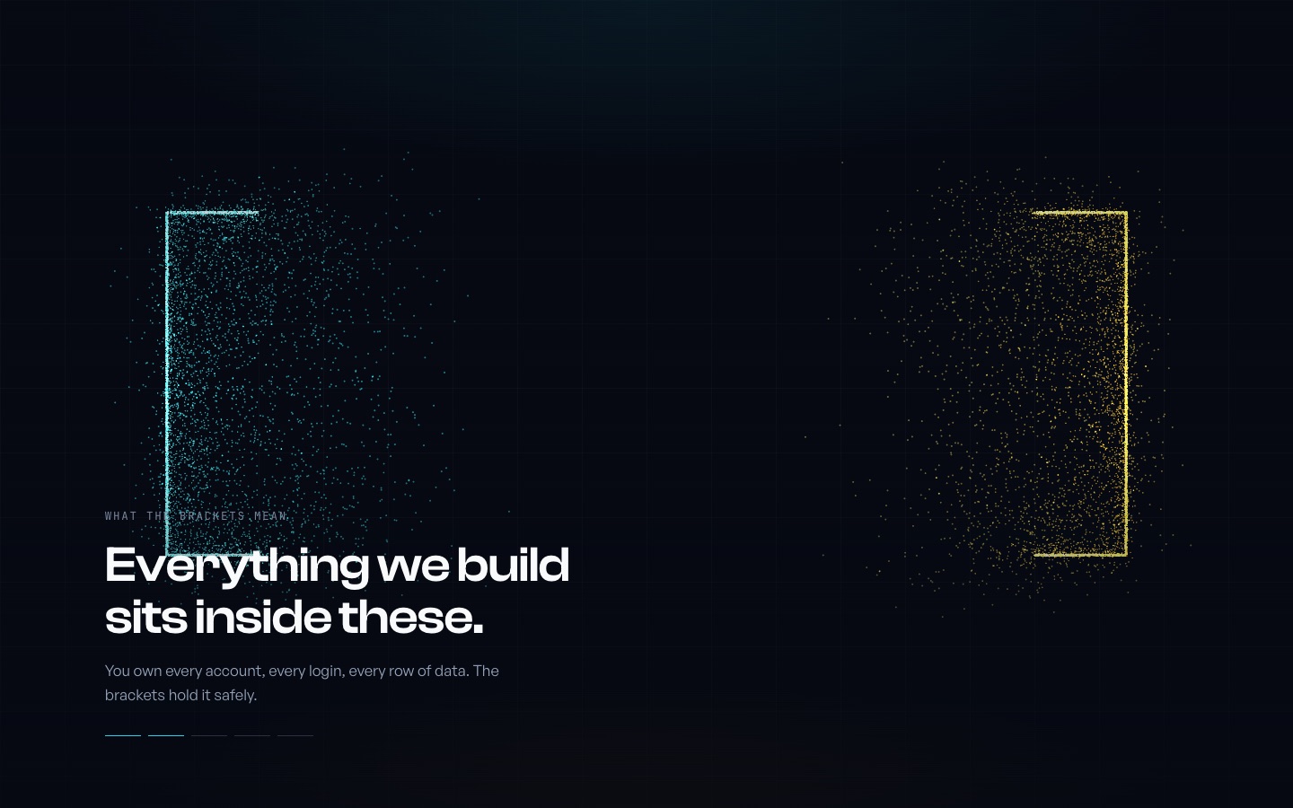
We did not stop at a report. The same afternoon, two scenes went live on a private preview so the owner could scroll them on his own phone. Underneath both is one particle field: 16,000 points on desktop that travel between shapes as you scroll, from the contour map the site already opens on, into the brackets of our own logo sampled from the real wordmark, into any of the 32 hand-drawn service motifs, and back.
It loads no new animation library, respects the reduced-motion setting with a designed still frame, runs without WebGL on phones, and keeps the site's rule that nothing above the fold waits for JavaScript. The screenshots on this page are from that preview, not from a mockup.
What changes next, in order
First the tells. The index labels, the pulse, the arrow on every link, and the uniform card go, and the brand book changes in the same commit so they cannot return. Then the pages that carry the business: every service page shows what you need to decide in the first screen, and every card in the catalog says plainly whether you can order it today, talk to us first, or join the list. The catalog gets a scale, systems, machines, and entries, so a $99 product and a full system never wear the same frame again. Then the night scene replaces the hero. Then the proof: the guardrails published as a document, an architecture page for the medical platform we built, and the terms in both languages.
About a quarter of work, done in public, one preview at a time, with the owner signing each step on his phone before anything ships.
What this means if you hire us
The review you just read is the review your site gets before we quote anything, and you get the report card, not a pitch. We run every machine we sell on our own businesses first, and that rule now covers the website too. If the numbers or the findings on your site are unflattering, we will print them the same way we printed ours.
Keep the report
The full case study with the scores, the findings, the six concepts, and the screenshots, in one file.
Disagree with any of it? Good. Bring a calculator.